
Design guidelines
Our identity is about vision and values, capturing the experience of FARM. Consistent use of design helps us build trust and generate lasting relationships with our partners.
Logo
This is our primary logo for all communications. It unique to us. Do not stretch, skew, or alter the spacing of any version of the logo for any reason.
 Download
 Acronym
Alternatives
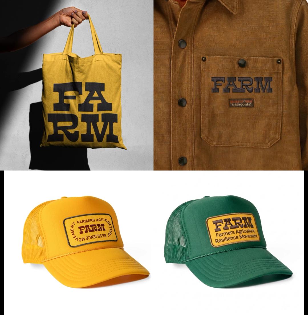
These alternate versions are designed to offer flexibility while preserving brand consistency across a range of applications.
 Download
 Typography
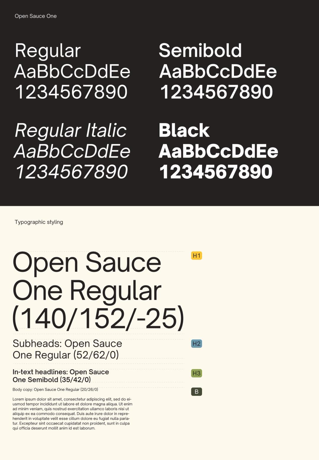
Fonts express as much as words. They convey feeling, establishing a consistent and ownable visual language for FARM. Use Open Sauce One for all communications.
 Download
 Color usage
Our colors are inspired by farmlands of Kentucky. Yellow comes from the state flower, the goldenrod, adding energy and optimism.

Accessibility
To ensure our brand is inclusive and accessible to all users, color usage must comply with accessibility standards, particularly when layering text, icons, or graphics on colored backgrounds.
Ensure strong contrast Text and important elements must have enough contrast with the background. Aim for a minimum contrast ratio of 4.5:1 to ensure readability for everyone.
Don’t rely on color alone Color should never be the only way to convey information. Always use labels, icons, or patterns alongside color to support users with visual impairments.
Avoid busy backgrounds Don’t place text over images or textured backgrounds unless there’s a solid overlay that keeps the text easy to read.
Colors
Color has enduring emotional appeal. Our colors are stable, vibrant, and accessible.
Goldenrod Yellow
- Pantone 1235 C
- CMYK 0 / 25 / 94 / 0
- RGB 244 / 201 / 83
- Hex #F4C953
Canvas White
- Pantone 7499 C
- CMYK 1 / 1 / 29 / 0
- RGB 254 / 250 / 240
- Hex #FEFAF0
Sky Blue
- Pantone 7696 C
- CMYK 61 / 20 / 14 / 5
- RGB 116 / 153 / 173
- Hex #7499AD
Grass Green
- Pantone 2303 C
- CMYK 35 / 6 / 75 / 8
- RGB 148 / 163 / 93
- Hex #94A35D
Forest Green
- Pantone 4216 C
- CMYK 55 / 6 / 98 / 64
- RGB 69 / 74 / 56
- Hex #454A38
Tobacco Barn Black
- Pantone 7771 C
- CMYK 48 / 44 / 74 / 59
- RGB 36 / 32 / 32
- Hex #242020
Icons
These icons are part of your creative toolkit. Use them to help bring clarity of visual emphasis to a topic. Our icons can be used everywhere from social media posts to annual reports to presentations.
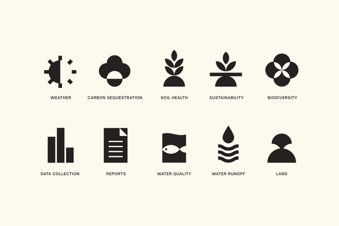 Download
 Photography
Our photography centers on people and place.
We show people in the context of their work, across industries, roles, and communities that drive the farming community and the state forward. Place is more than atmosphere; it’s distinctly local, rooted in landscapes, and the places where work happens.
This approach reflects who we serve and positions us as an active participant in Kentucky’s economy and community.
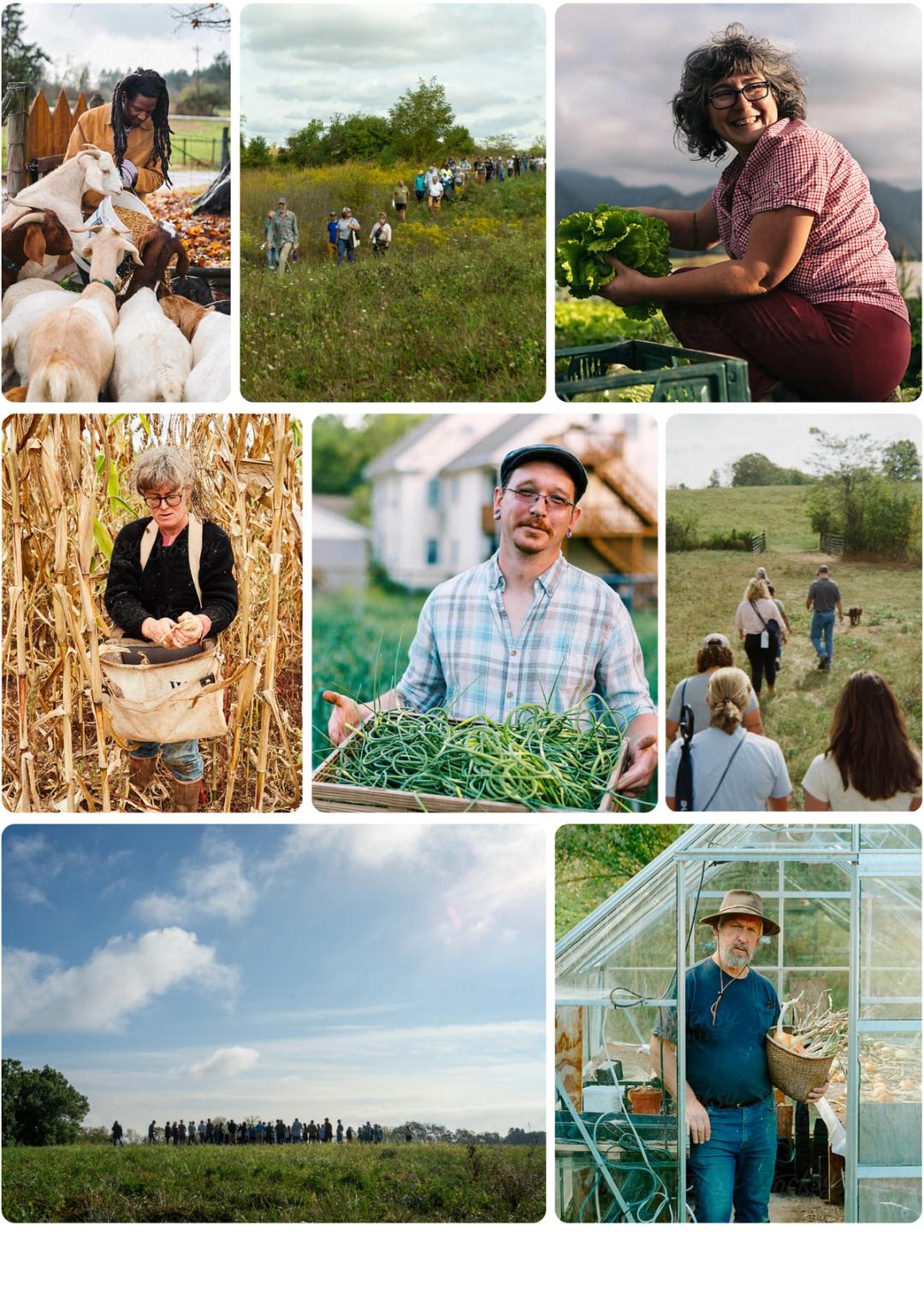 Download
 Photography guidelines
Photography plays a key role in conveying the approachable and honest personality of our brand. The goal is to produce imagery that feels honest and approachable.
Use natural light whenever possible, especially warm, natural light, to give photos an inviting feel. Whether capturing a candid moment or a relaxed portrait, our images should feel sincere. Do Show real people doing meaningful work Represent a range of products (agriculture, livestock, cut flowers, honey, etc.) Use settings that feel unmistakably Kentucky (Rural and urban) Include context: fences, greenhouses, storefronts Don’t Don’t rely on solely on landscape images Don’t use images that could be “anywhere” Don’t isolate people from context, avoid backgroundless shots
Reports
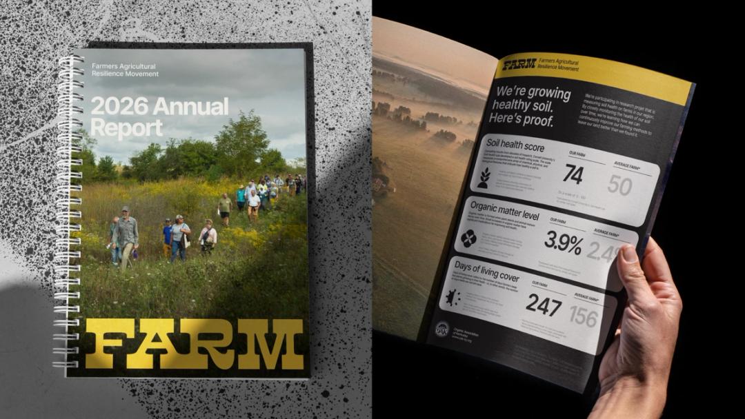 Download
Social media